
Anita Goodesign
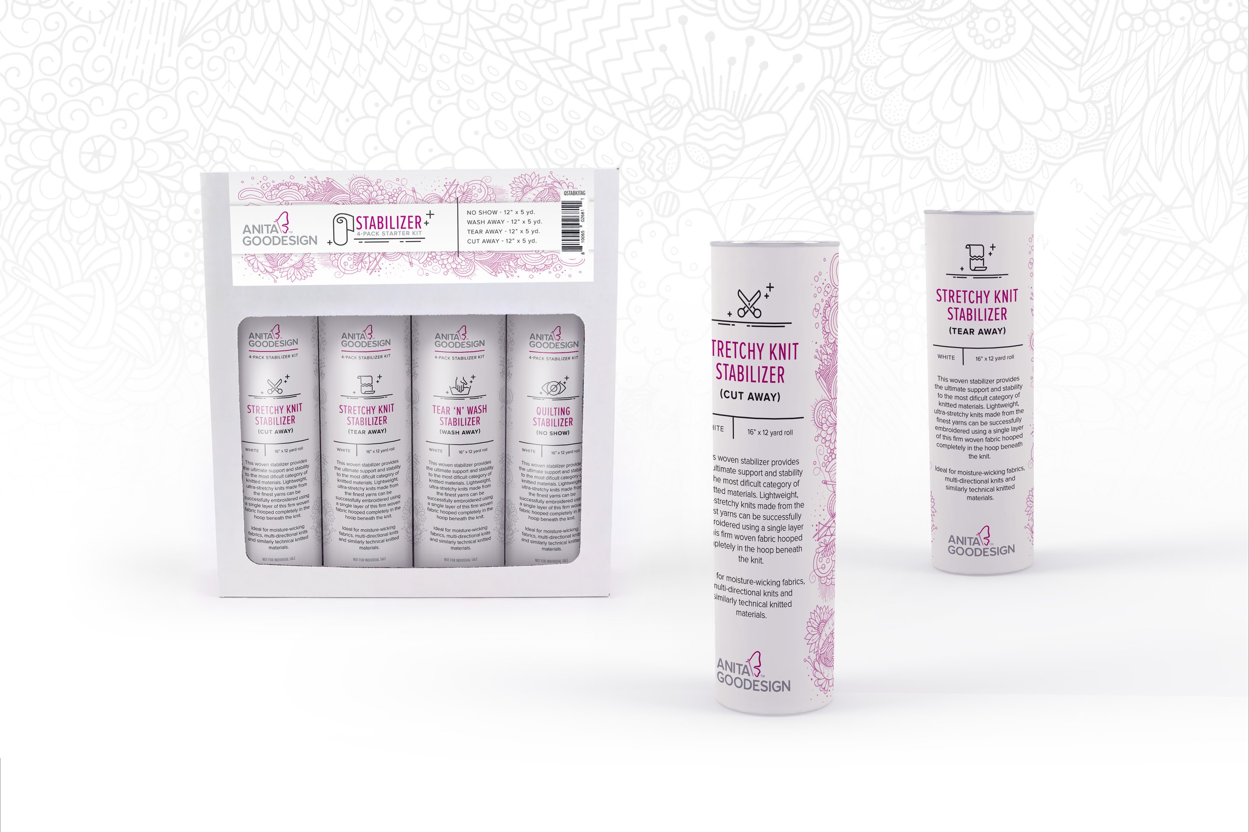
While at Anita Goodesign, I completely refreshed their brand with a new logo and look, while maintaining some of the original colors–a smooth transition for a customer base that is very loyal and invested in the heritage of the company and brand.
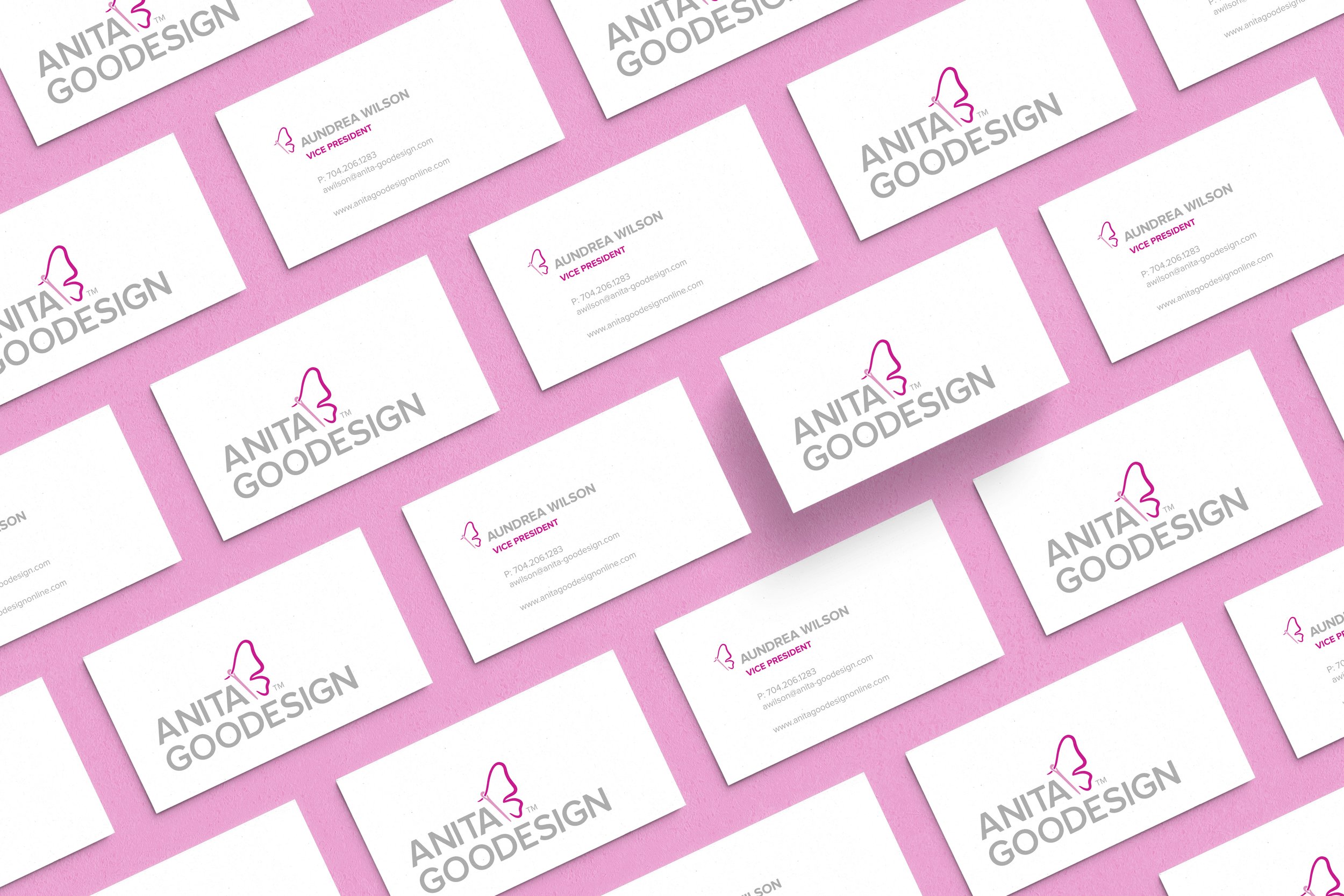


I introduced Proxima Nova as the main corporate font due to its very large family with a wide range of weights and styles. I paired it with the script Shelby to add a playful accent that fit perfectly into the modern look.

A Template for Efficiency
I also had the opportunity to introduce several updates to various processes, thereby making the company much more efficient, while taking their brand recognition to the next level.
Introducing the use of inDesign templates, I was able to standardize the look and process for completion of the product tutorial; an accompanying PDF that teaches customers how to stitch out their designs, and shows them other fun tidbits about the collection.
There are 3 main product lines for the design collections; Quilting, Project, and Embroidery. Each includes page layout variations for the specific needs of the type of product.
I directed the design team in keeping up with trends and refreshing the look of the tutorial templates as needed to push the brand’s evolution.
The tutorials for each collection released during a given month are put together into one magazine, together with additional editorial content. The All Access magazine maintains a fresh, but cohesive look every month, due to the processes and template system I implemented.